
The tech industry is always on the hunt for the next big feature that will make a splash on the market. The last ten years brought a lot of innovation to how we interact with our devices thanks to touchscreens.

User experience (UX) designers leveraged this new tech and the graphical interfaces evolved around that new way to interact with devices. Touch UI went from older skeuomorphism design to modern flat design using bold colors. The best examples are the design transitions between iOS 6 and 7 where Apple introduced a dramatically different UI design and Android transition between Kit Kat 4.4 and Lollipop 5.0 where Google introduced its new Material Design foundations.
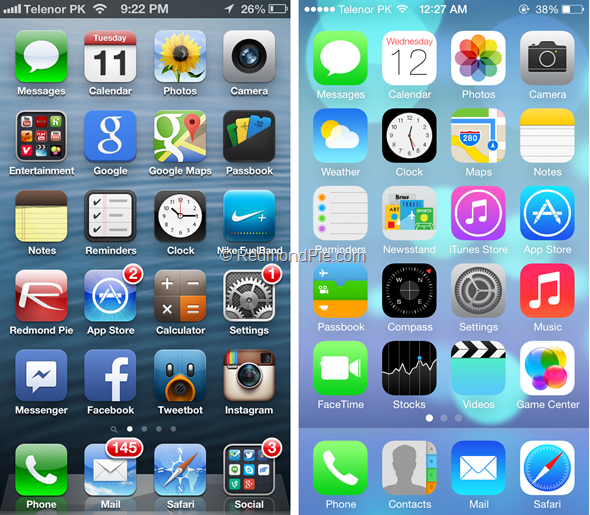
Photo Source: www.redmondpie.com
Now that the graphical interface of our devices is refined, UX designers are looking for new ways to improve their products’ experience. Fortunately, thanks to next-gen HD piezo haptics, designers now have a new way to bring their UX to the next level by incorporating advanced touch effects.
Devices already use basic haptic effects to share information with their users. Notifications vibration (incoming phone call or text message) and vibration when typing on a touch keyboard are simple examples of daily touch interaction we can have with our smartphones.
HD piezo haptic hardware unlocks new possibilities in terms of touch effects. Haptic effects can now get richer, with more details and nuances, stronger and more immersive. UX designers can now create a more personal, tailored experience for their users.
Since next-gen piezo haptics represents a major leap in touch effects, UX designers will have to take the time to analyze how to leverage them properly. Here are a couple of tips and a list of do’s and don’ts to achieve the best result when designing your next-gen touch experience.
Improving Traditional HMI and Think Outside of the Box

If you think of haptic feedback as simple vibration or buzz, you should do a simple reset and reconsider what new haptic technologies can do. Next-gen piezo HD haptics certainly can improve the traditional haptics we are used to feel, like notifications, impacts and click effects, but they can do much more. Think of complex and rich textures, like feeling the fabric of your next shirt on your touchscreen or feeling the friction between your stylus and your tablet replicating the feeling of using a pen on a sheet of paper (our friends at Tactaï created this cool feature).
Next-gen haptics can help you create more advanced experiences and it’s up to UX designers to leverage it. To do so, they need to analyze how their customers interact with their devices and think of new creative ways to improve the touch experience. Think outside of the box!
Golden Rule of Haptic UX Design: Create Natural Touch Experiences

This new touch effects playground is exciting, but there are some ground rules to follow to create the best experience. The one golden rule to create the best UX: You need to create natural experiences!
Haptic feedback should be judiciously used as complimentary feedback when building your experience. Haptics should be invisible. It should feel like an extension of the device. The user shouldn’t notice feedback as the first UX element. It needs to feel just right!
Here is a list of Do’s and Don’ts to make sure you respect the golden rule!
Do – Use Haptics with Consistency
One key factor to create impactful touch experiences is to use haptics with consistency. The UX designer must build a clear relation between haptic effects and triggers. If you want to add clicking effects to your UI buttons, it’s best to add the feedback to all UI buttons.
Clear trigger-feedback patterns help the user memorize how to use the UI and reduce the learning curve.
Do – Use Haptic Standard Language
It’s also important to use predictable patterns and established standard haptic languages. While there aren’t official guidelines on the relation between behavior and touch patterns, your customers are experiencing haptic feedback with their current mobile devices. While those effects aren’t very rich, they do use some predictable patterns to share information. UX designers should be aware of those foundations and build upon them.
Here are examples of patterns normally used in haptics applications to share confirmation notifications to the user:
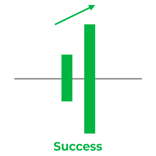
Success Haptic Notification Pattern
Short and rising intensity bursts
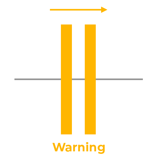
Warning Haptic Notification Pattern
Short and flat intensity bursts
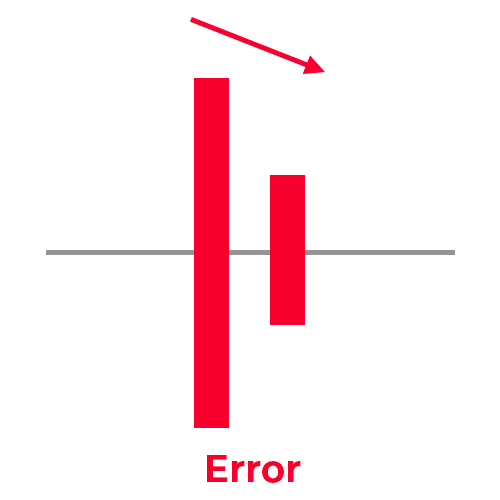
Error Haptic Notification Pattern
Short and descending intensity bursts
Do – Test, test, test… then test again!
Next-gen haptics opens up touch UX potential. Since those technologies are fairly new and represent a major leap in features, there isn’t a lot of clear guidelines on how to use them.
Therefore, it is really important to test your designed experiences! Design, test, iterate is a mantra UX designers are used to and haptics isn’t different. You may believe some patterns are predictable, but you won’t know for sure if you don’t have user input!
Do - Make Haptics Optional
All your users are different. They may not all like the same things. For different reasons, they may prefer to opt-out of using haptic feedback in their UX. Give them the choice!
For any reason (accessibility, better battery life, bad implementation or simply because they don’t like vibration), your user needs to have complete control over whether or not they use haptic feedback in their UX.
Don’t – Overuse Haptics
It can be easy to be excited by new possibilities that next-gen haptics unlock, but be careful to not overuse haptics in your UX. Too much of a good thing can be a bad thing. Too much haptic feedback makes the UI more complex and risks to annoy your user. Remember to create natural experiences.
You probably once saw a PowerPoint presentation where the speaker got too excited with all the different animations and transitions? Chances are high that you quickly stopped listening and started to wonder what the next animation would be. The speaker lost its audience because of overusing animations. The same applies to haptics. Too much haptics will turn the user’s attention away from the other elements of your UX. Keep it natural!
Don’t – Use Unpleasant Haptic Feedback
UX designers should avoid using unpleasant haptic feedback. And by unpleasant we mean effects that break the natural interaction.
Some effects are related to different emotions or behavior. Negative emotions can be shared with haptics, but they aren’t necessarily unpleasant. For example, think of standard notification tactile effect patterns you saw earlier (success, warning and error). The error feedback pattern can be associated with “negative” emotions, but it is a good thing. You needed to share this information with your user. Therefore, it’s natural to use it.
Unpleasant haptic feedback is when the effect feels “off”. Too strong feedback for button clicking is an example. Our user shouldn’t have to jump and be surprised when he’s clicking a button, the same way you could use haptics to surprise your user in a game or video.
Be sure to make your interaction natural and test your UX!
Don’t - Forget Visual and Audio UX Elements
Haptics is meant to be complementary to other UX elements. Therefore, you should continue to give visual and audio elements a lot of importance in your experience designs.
The best user experiences need to synchronize visual, audio and haptic feedback. When your user clicks on a button, the visual, audio and haptic feedback should trigger at the same time. More importantly, haptic feedback and audio feedback needs to be closely synchronized since they often share the same predictable patterns.
Again, think of the standard notification patterns (success, warning and error). Think of standard audio feedback related to the same situations. They are identical!

Success Audio Notification Pattern
Short and rising volume audio cues

Warning Audio Notification Pattern
Short and flat volume audio cues

Error Audio Notification Pattern
Short and descending volume audio cues
Audio and haptics are both based on vibration principles. The human body interprets them in similar ways. Therefore, it is important to have perfect synchronization of those two UX elements since they’re deeply connected.
Next-Gen UX Design includes High-Definition Haptic Feedback
Hopefully, these tips will help UX designers integrate successfully next-gen haptics into new products. New piezo HD technologies have a lot of potential and the best is yet to come. Haptic development is fairly new compared to other UX elements. It’s up to UX designers to leverage this new technology and create rich and immersive new experiences.

Leave a comment